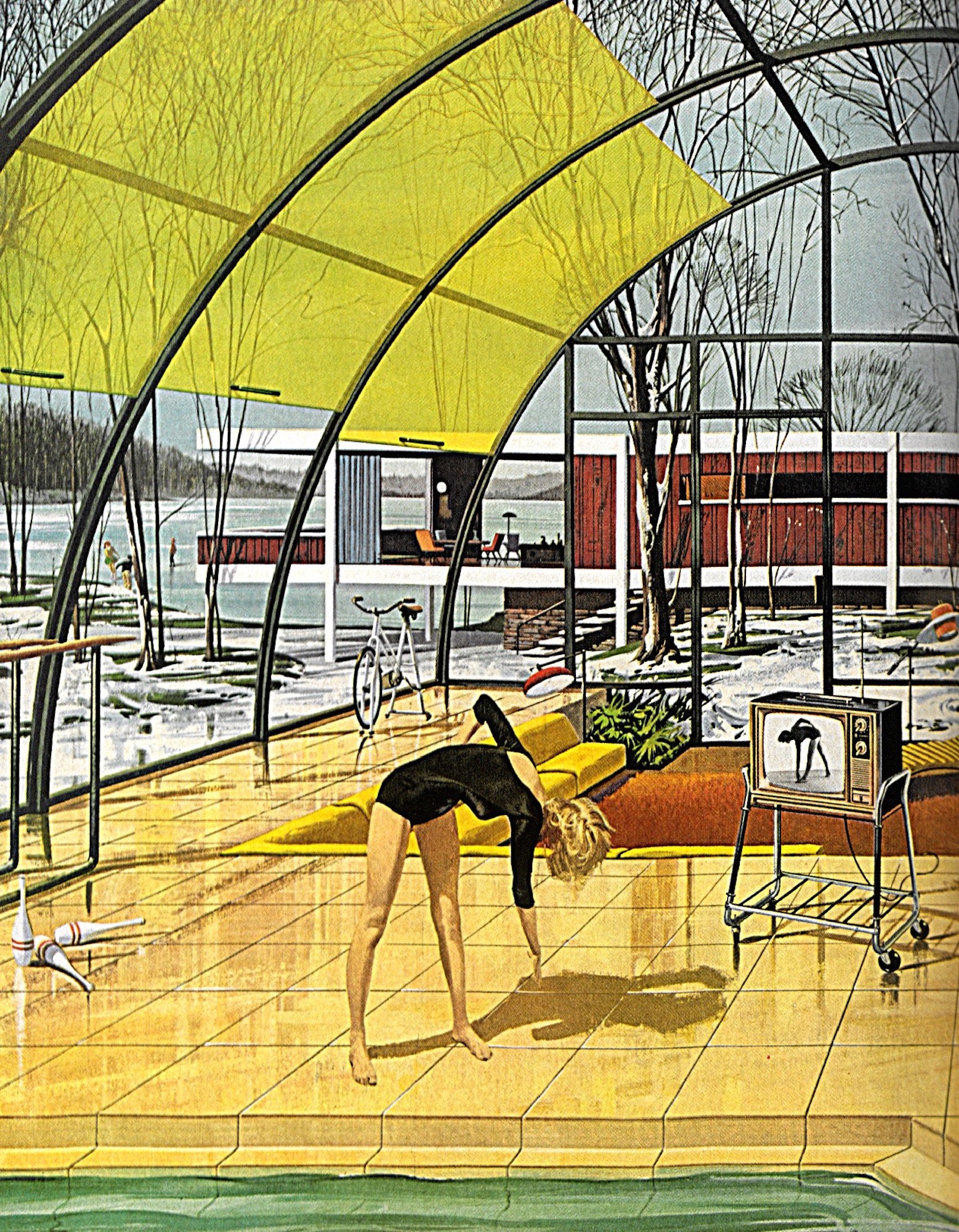
Think of postwar America, and what often comes to mind is a white, heterosexual family, pictured in a domestic suburban environment. You can tell this family lives in the suburbs because there is a lawn in the background, a tree framed in a picture window, a swimming pool glimmering behind a glass wall.
This almost-mythical family you are visualizing is drawn directly from a generation of magazine ads, commonplace during the mid-20th century, that portrayed so-called “indoor-outdoor living,” where the refinements of domesticity were combined with the restorative powers of nature. The indoor-outdoor look didn’t just sell things that suburban houses required or were improved by—like cars, construction materials, or domestic appliances. It also sold an illusion: Americans might imagine themselves living partly outdoors, but the ads ultimately promoted a life that took place inside all of the glass, metal, and wood that was being advertised.
As these idealized images of suburban life—indoor-outdoor living among them—took hold, Americans responded to the “allurement of open space,” as one film by the U.S. Chamber of Commerce called it. They moved away from cities, took out their wallets, and forged a consumer culture that largely depended on the ever-increasing material needs deriving from suburbanization. In doing so, millions of Americans bought the idea—as housewares manufacturer Revere Copper and Brass put it in a 1942 ad—that a home was “no mere space bounded by walls and divided into rooms,” but “a way of life to keep pace with your needs, to change with your tastes, to grow with your means.” In other words: a way of life that would keep you buying stuff.
After the end of World War II, real estate developers began planning and promoting open and spacious suburbs on a mass scale as an alternative to the unsanitary and overcrowded industrial city. This became possible for a number of reasons: first, farmland was relatively inexpensive, and often no longer needed for agriculture. Second, the war effort had led to the rise of new construction methods, based on standardization and prefabrication that considerably cut down building costs. Finally, the poor state of the existing housing stock and the growing population led the federal government to invest in new developments, especially by subsidizing mortgages for veterans and young couples, which underwrote “white flight,” as increasing numbers of white families moved from cities to suburbs.
To encourage this trend, advertisers decided to spotlight the suburbs’ desirability by capitalizing on their non-urban qualities, with a twist: they presented suburbia as a place where the comforts of civilization (that is, urban living) merged with the soothing embrace of the natural world. The suburban house was no homestead in the Great Plains; it was an outpost of modernity and convenience built on the frontier between the city and the wild. Advertisers dreamed up a seamless interpenetration of indoors and outdoors, homey interiors and sunlit exteriors, living room and back yard—visual evidence that it was possible to have the best of both worlds. They directed those images into millions of American homes through the pages of LIFE magazine, whose circulation peaked at more than eight million in the late 1960s.
The indoor-outdoor look didn’t just sell things that suburban houses required or were improved by—like cars, construction materials, or domestic appliances. It also sold an illusion: Americans might imagine themselves living partly outdoors, but the ads ultimately promoted a life that took place inside all of the glass, metal, and wood that was being advertised.
These indoor-outdoor viewscapes were in fact a downscaled rendition of the modernism of Frank Lloyd Wright’s organic designs, or the glass houses by Mies van der Rohe, Philip Johnson, and Richard Neutra, all of which revolutionized high-end domestic architecture in the U.S. In the eyes of architectural critic Sigfried Giedion, these modern American houses marked a new chapter in the history of world architecture. In his posthumous work Architecture and the Phenomena of Transition, Giedion wrote of an era in which the boundaries between inside and outside were no longer clearly defined because peace, wealth, and technology had enabled humans to stop seeking shelter from the outer world. This was an age in which “interior and exterior space continually interpenetrated one another, establishing new interrelationships.” It was a new form of architecture defined by “a simultaneous striving both for freedom and for order.”
Although most Americans were ready to join in Giedion’s appreciation of this new architectural style, they could not afford these homes with their walls of endless and prohibitively expensive glass plates. But popular ads presented the new middle-class suburban home as a standardized and mass-produced version of the same type, a domestic dream within anyone’s reach. Ads and magazines called it “indoor-outdoor architecture.”
The marketing surged. In some instances, companies exploited these visions of suburban heaven to sell commodities that were linked with outdoor living. Aluminum, for instance, had become the metal of choice to manufacture everything from lawn mowers, awnings, fences, and outdoor furniture to aluminum foil and kitchenware. It was just as useful inside the home as outside it, but not as easily marketable—so showcasing it as the perfect material for outdoor living, as the sector’s leading company, Reynolds, did, made it more appealing to shoppers seeking all kinds of products.
Windows were another case in point. They were an essential fixture to protect interiors from weather and unwanted intrusions—but in mid-century ads, they became a way to frame the outer world and transport it inside, as a beautiful picture. By installing extensive sheets of glass like the popular Andersen Windowalls, for instance, one could “furnish the outdoor fun.” If the outdoors was the perfect setting for leisure activity—barbecues, picnics, and parties—window frames and glass plates let these visions (and through them, leisure as a way of life) penetrate the domestic environment. Glass made a house almost immaterial, giving residents the impression of living on their lawn instead of under a roof—or so these ads seemed to suggest.
The charms of the outdoor world could enhance not only where people lived, but also where they worked and went to school. Companies relocating to suburban office parks could enfold employees in the peaceful arms of nature, making the dull monotony of work all the more bearable. Suburban schools could be a place where “young minds find more room to grow,” according to ad copy from Libbey-Owens-Ford, a major glass-plate provider.
Most industries banked on the suburban ideal because that was where most consumers lived. Indoor-outdoor architecture became a visual cliché for postwar advertising of all sorts of goods. Some indoor-outdoor images encouraged activities quite alien to what most think of as the purportedly outdoorsy suburban life—for example, watching TV. And yet, between 1962 and 1963 Motorola ran a series of ads in LIFE magazine that depicted this most domestic, indoor-oriented of all hobbies in suburban fantasy homes, each harmoniously integrated into the landscape. The implied message was that TV and radio could illusorily take viewers and listeners outside the limits of their domestic world, thus counteracting the potentially claustrophobic properties of these technologies. These fictional modern architectures were born out of the imaginative mind of illustrator Charles Schridde, and some were clearly reminiscent of actual examples, such as Mies van der Rohe’s Farnsworth House or Frank Lloyd Wright’s Taliesin West.
Driving was another essentially interior activity promoted with indoor-outdoor imagery. It was advertised as an outdoor activity in itself, because car owners had a world of unlimited adventures at their feet, or rather, wheels. And yet, drivers would mostly contemplate the beauty of the outdoors from a hermetically sealed capsule, and as suburbs sprawled further and further out, the hours spent behind the wheel grew exponentially. One could roll down the windows—but why, when the automobile interior was conveniently air-conditioned?
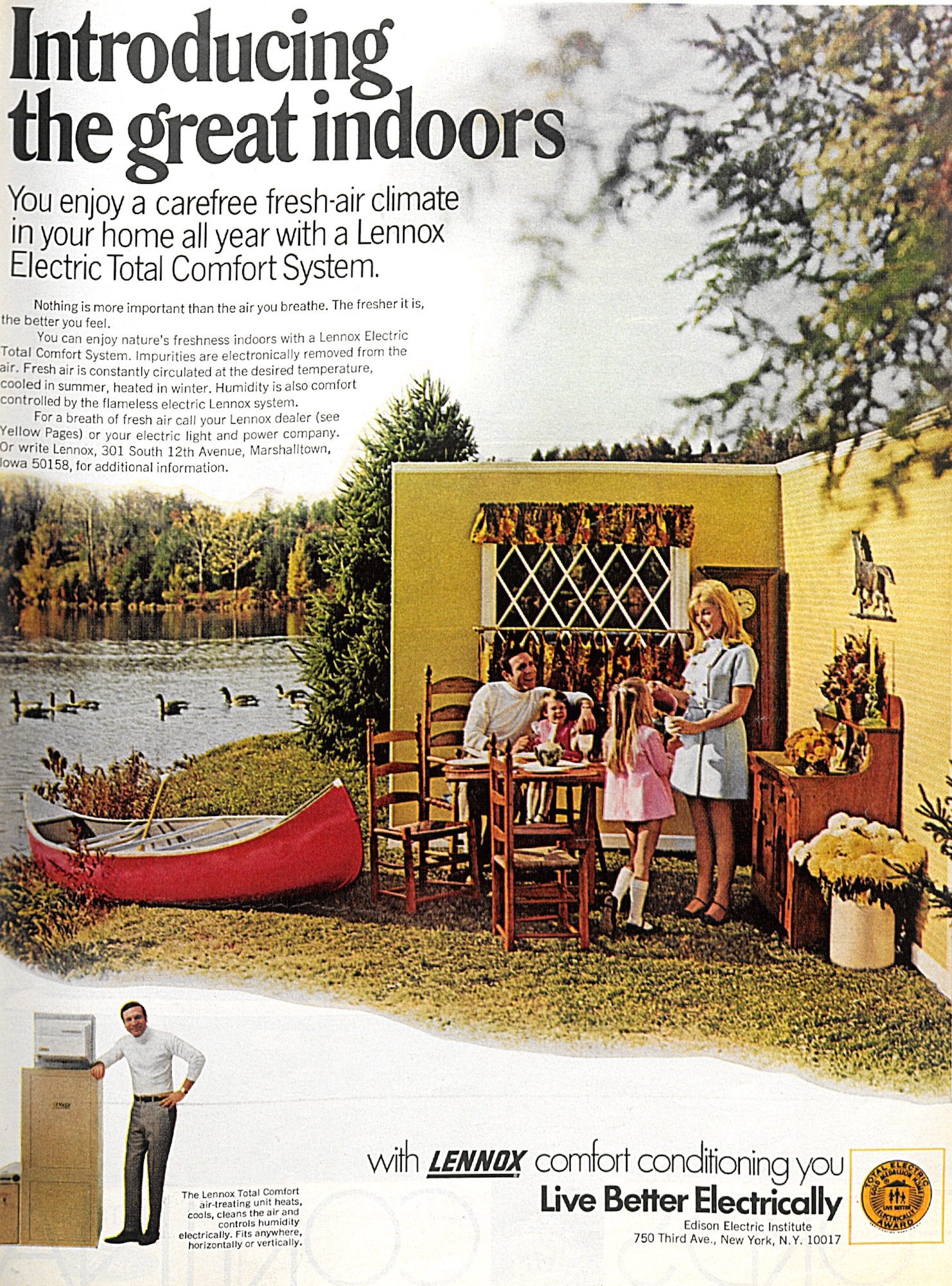
A suburban home, too, could be a controlled climate, but it took a dose of the indoor-outdoor mystique to win people over to the idea. Many postwar consumers resisted air conditioning because it required closing windows tight to function properly, and seemed to force people into a self-imposed domestic captivity. So creative directors on Madison Avenue hoping to push air conditioners had to suggest quite the opposite idea: that living in an air-conditioned house was like living outdoors all year round. Fresh air came to seem almost unnecessary, since one could artificially reach climatic nirvana inside one’s home.
Once again, the suburban house metaphorically dematerialized: it became “the great indoors,” as a Lennox air conditioning ad put it. In contrast to the images of advertising, ordinary life—the time people spent doing housework, playing, watching TV, driving a car to go to work or run one’s errands—took place indoors. The outdoors was transformed from a place to enjoy to an abstract concept. Postwar suburbanization ultimately put Americans into comfortable, all-encompassing interiors, allowing them to go from the living room to the garage to the car to the mall without ever coming into contact with fresh air.
Andrea Vesentini is a cultural historian specializing in American architecture, and urban and visual studies. He is the author of Indoor America: The Interior Landscape of Postwar Suburbia.
Buy the Book
Skylight Books | Powell's Books | Amazon
PRIMARY EDITOR: Eryn Brown | SECONDARY EDITOR: Thea Petchler


Add a Comment